Rebranding ZEBRA Varnishes Line
Year: 2020
Client: ZEBRA
Role: Packing Design
Tools: Adobe Illustrator, Adobe Photoshop
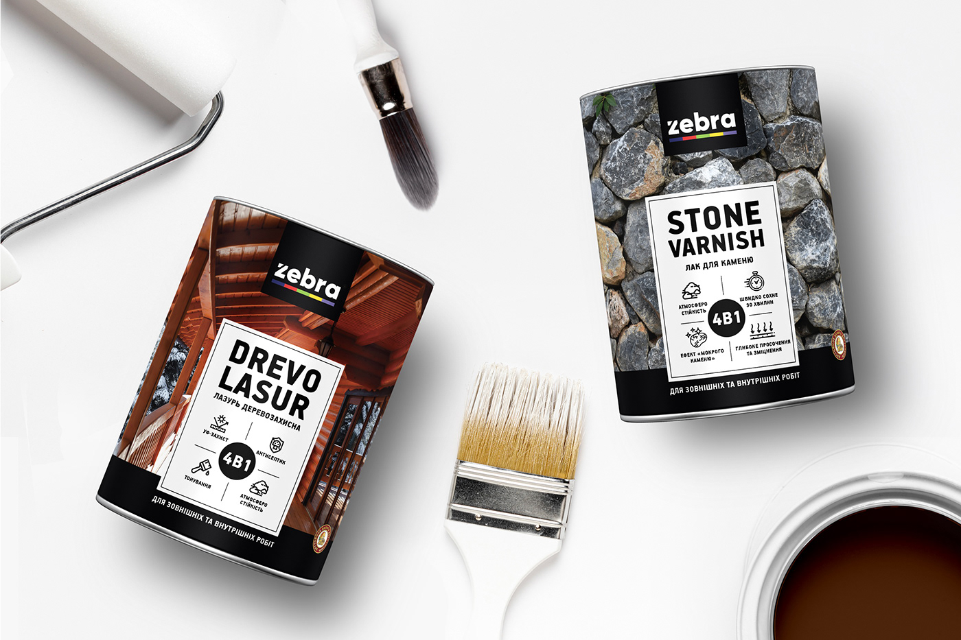
The main objectives of rebranding ZEBRA are the harmonization of the brand visual attributes and its self-presentation by usage of natural origin symbols of products and unique handmade style. At the same time, the idea was to bring up-to-date, modern and fashionable features to the design, and make the packaging memorable, attractive and individual. The new design concept makes the product a standout among other wood coating products within market.
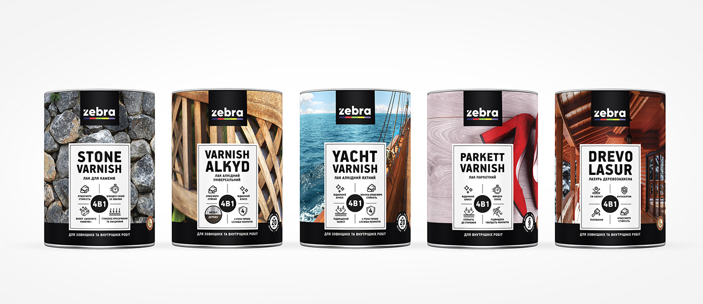
The main brand colors are now deeper and stronger, which makes it easier for the consumer to identify and distinguish each product of the series and from products of competitors. The dominant element of the packaging is a textured image of wood or wood products. The overall minimalist design has pointed out premium quality of the product.

The mainline includes Drevo Lasur, Parquet Varnish, Yacht Varnish, Alkyd Varnish, Stone Varnish.
The trademark ZEBRA is the flagship of the paint and varnish manufacturer, a legendary brand that the buyers know and know best. For 20 years, ZEBRA has supported the title of one of the best domestic goods and people’s favorites.
The trademark ZEBRA is the flagship of the paint and varnish manufacturer, a legendary brand that the buyers know and know best. For 20 years, ZEBRA has supported the title of one of the best domestic goods and people’s favorites.
The new designs for TM ZEBRA have underlined the value and uniqueness of the product, revealed main product characteristics and improved visibility, readability and memorability.